Process Posts

Interview with Kathy Temean - Illustrator Saturday

Kathy Temean kindly interviewed me for her blog this weekend, and I answered some questions and talked a bit about my process for making a digital drawing. Here’s a link to the interview:

https://kathytemean.wordpress.com/2021/08/21/illustrator-saturday-matt-schu/

Interview with Chillhop Music

I had a nice time talking with Ben at Chillhop recently about my process for making the recent Psalm Trees / Guillaume Muschalle album art with them. We also talked about working remotely, social media, and other stuff. Here’s a link to that interview:

https://chillhop.com/5152-art-process-mood-vs-subject-an-interview-with-matt-schumacher/

Along with that, they have up on their YouTube channel a realtime video of me re-drawing the cover art with ink and gouache. They’ll be giving away the drawing as part of a raffle soon.

Process Post - "Salut! V" coasters

I contributed 6 drawings on coasters to Nucleus Portland gallery’s “Salut! 5” group show which opened on June 12th. I took a few photos while I was making them so I’ve put together a short post to explain the process.

Before starting on the coasters I made a small ink/gouache drawing of a person sitting on a roof looking up at the sky (fig. 1). I wasn’t planning on using that as the basis for all my coaster drawings, but after I made it I thought it would be fun to make variations of it with different things in the sky, and decided that would translate well to the coasters.

Since it was important to make the parts that were the same across all the coasters be as identical as possible, I did a graphite transfer to make the pencil lines on each blank coaster. To make the transfer I traced the preliminary drawing onto a piece of printer paper and then covered the back of the paper with graphite. Then I put the tracing on top of the blank coaster, graphite-side down, and traced the drawing (pushing down fairly hard). The result is that the lines get transferred in graphite onto the coaster, like a carbon-copy. (fig. 2)

After that was done I traced the pencil lines in waterproof black ink (fig. 3), which I did with a nib and brush. It was important for the ink to be waterproof because otherwise adding color on top would make the lines run.

At this point I began adding color to all of them at once, and they were all finished at more or less the same time. I used colored ink, water, and white acrylic gouache which I mix with the ink. After I finished them all, I sprayed them with a matte varnish to even out the sheen and hopefully give them some protection. (Even though these are coasters, I think it’s safe to assume these are not at all waterproof.)

Well, that’s the whole process. You can see the finished product here (fig. 4). Also check out the other coasters from the show online at Nucleus Portland’s website. As usual there is a lot of excellent work in the show.

Process Post - Posted Keep Out

Based on a spot I saw in NE Portland, this drawing is 32x41.5”, ink on paper.

Here it is with some close up/context shots:

“Posted Keep Out”, Matt Schu, 2020, ink on paper, 32x41.5”

And here are a few pics of it in-progress:

Process Post - Materials I use

I’m always curious about the materials other artists use, so I put together this post of my materials (scroll down to see pics). Generally speaking I use pens & ink & gouache on watercolor paper. I mix the ink in a palette and dilute with water to change the opacity/intensity of the colors. I try to keep my setup as portable as I can, so — other than the bottles of colored ink and the varnish — I carry all of this with me in my backpack wherever I go.

Not pictured is the Epson scanner I use. When I’m done with a drawing I’ll scan it as a 600dpi PNG and then open it in Photoshop to adjust the colors and contrast to match the real life version as much as I can. Alternately, if I planned to add color digitally, I’ll scan the grayscale ink drawing and add color in Photoshop. When I do this, I’m not concerned with making the scanned grayscale version match the real life version as much as I’m concerned with making the contrast strong. When coloring digitally, I’ll use my iPad as a drawing tablet connected to my computer. To do this I use the app Astropad.

Here’s are some random tips:

  • Windex (or generic window cleaner) works just as well as pen cleaner, if not better, for a fraction of the cost.

  • Buy masking tape at a paint store, not the art store. The paint store will have more options for way cheaper.

  • When applying the varnish, build up thin coats. If you put on too much, it can pool weirdly and leave a white powdery residue (and it’s a waste).

  • I apply linework and spots of black first, then add color/shading with ink. That’s why the black ink being waterproof is very important to my process.

Process Post - Caught in the Rain

Here’s a summary of my process for a recent drawing, which I’m calling “Caught in the Rain”. This is one of several drawings featuring this old man and his black cat.

I wanted to draw these characters again, and I also wanted to draw some rain. After coming up with the idea, I started with a quick thumbnail sketch (fig. 1) to make sure I liked the layout (when I draw I use Xs to indicate which areas will be filled with black).

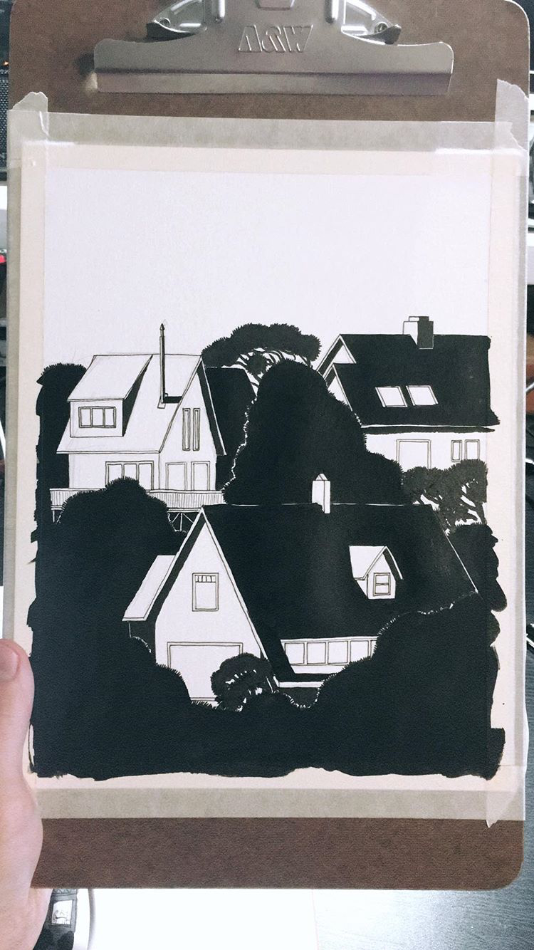
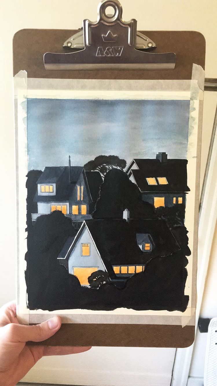
Next I made a grayscale ink drawing on watercolor paper (fig. 2). I drew the outlines with a micron pen, then added gray tones with a series of washes of diluted black ink. After that, I added black with a brush and ink, and drew the rain with gel pens and a ruler.

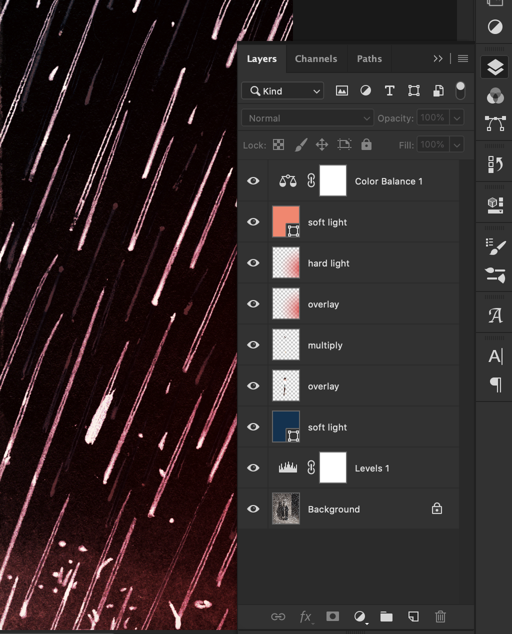
Once the grayscale drawing was done, I scanned it and opened it in Photoshop (fig. 3). In Photoshop, I adjusted the black/white/gray levels to make sure the contrast looked good and had pure black and white. Then I added color with layers set to different modes (fig. 3). Overlay & Soft/Hard Light modes tint the original ink drawing below, while Multiply adds a translucent spot of color.

After this, I adjusted the color balance and saturation to make the colors look how I wanted them to. Adjusting the color balance is also a great way to unify the color palette. I use adjustment layers when I can because they give me flexibility to change things later, as they don’t edit the original drawing in a permanent way.

Anyway, then I saved the finished drawing (fig. 4) and later posted it to social media. Now I’m blogging about the process and you’re reading it. And hopefully you found this interesting or helpful in some way.

Process Post - Shooting Star ink drawing timelapse

This is a timelapse video I recorded in November 2018. I used ink and acrylic paint for this drawing. As usual, I mixed my colors using a few primary colors of india ink and diluted them with water.

My Vimeo profile: https://vimeo.com/mattschu

Timelapse video of an ink drawing, from pencils to final version. Filmed in November 2018 in my studio in Portland, Oregon. Instagram: @mattxschu matt-schu.com © Matt Schumacher 2018

Process Post - Beach Houses at Dusk from 9-2018

Here are some process pics of an ink drawing I did last year, which I’ve called “Beach Houses at Dusk” (2018, 8x10”, ink & acrylics).

I made this with india ink and acrylics on watercolor paper. I mix the colors I use for my ink drawings from 4 main colors: aqua, magenta, yellow, & black. I dilute the color I’ve mixed with water in varying amounts and build it up gradually in layers like a watercolor painting to get the opacity I want. I also use acrylic paint to add lighter details on top of the dark areas.

This is a way of working that I’ve been doing for a little while now, but back when I made this drawing in September 2018 I was still dialing-in the process.

At the moment this is the process I use most often; for a little while I’ve been trying to use physical media as much as possible. It’s not that I never use digital methods, but I just like to keep it to a minimum when I can. I’ve fluctuated over the years with how much digital art I do, but over time I’ve found I gravitate more toward physical media, both in my own work and in the work of people I admire.